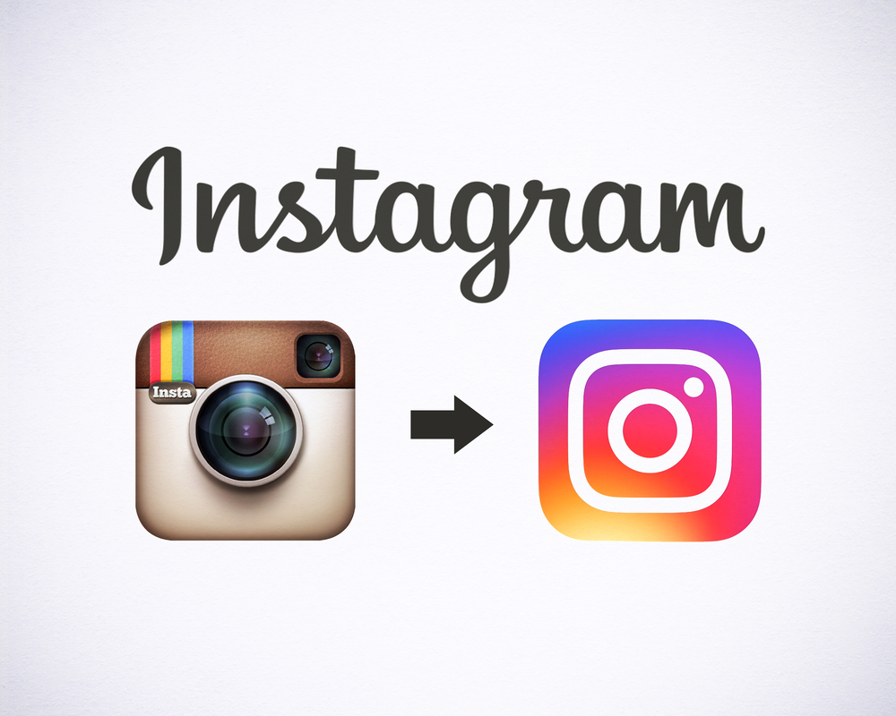
So big news on the recent social media scene: Instagram changed their logo and the internet went wild. People had a lot to say about their new logo – and it wasn’t positive – why?

Here’s what Raymond Wong of Mashable had to say: “Instagram finally changed its app icon this week and, boy, did the Internet react. The iconic instant camera icon — with a glass lens, viewfinder, brown leather wrap and rainbow, alongside the word “Insta” in the corner is gone. As I’m sure you’ve seen by now, it’s been replaced with a simplified glyph in the shape of a camera outlined in white and set on top of a yellow-orange-red-pink-purple gradient.
It’s definitely different. Instagram recently said that, during the creative process of flattening the icon, it wanted to make sure the updated look was still recognizable.”
Here’s how Instagram explained the change in a blog post announcing the new look, “The Instagram community has evolved over the past five years from a place to share filtered photos to so much more — a global community of interests sharing more than 80 million photos and videos every day. Our updated look reflects how vibrant and diverse your storytelling has become.”
What do you think of Instagram’s bright new logo?


